Chank Diesel Is Terrified of Becoming Boring
by Jerome Paulos • April 7, 2023

Jay Larson
Chank Diesel is a very normal guy.
He lives in a white and brown house in northeastern Minneapolis that’s perfectly identical to its neighbors—except for the giant panda, arms outstretched, on the garage door.
“Weirdness” has been the key to his success, and he’s worried he’s losing it as he ages. A lot has changed since he debuted on the design scene in the early 1990s. He’s designed hundreds of typefaces, published a book, and had a son. “I’m not as prolific as I used to be just because I’m more distracted by life and I enjoy not working,” he said.
Chank, 54, designed his first font when he was still a student at Macalester. He named it “Mister Frisky,” and it remained one of his most popular fonts for years, appearing on everything from fast food packaging to book covers. Since then, his work has appeared everywhere from Prince albums to the pages of the Wall Street Journal.

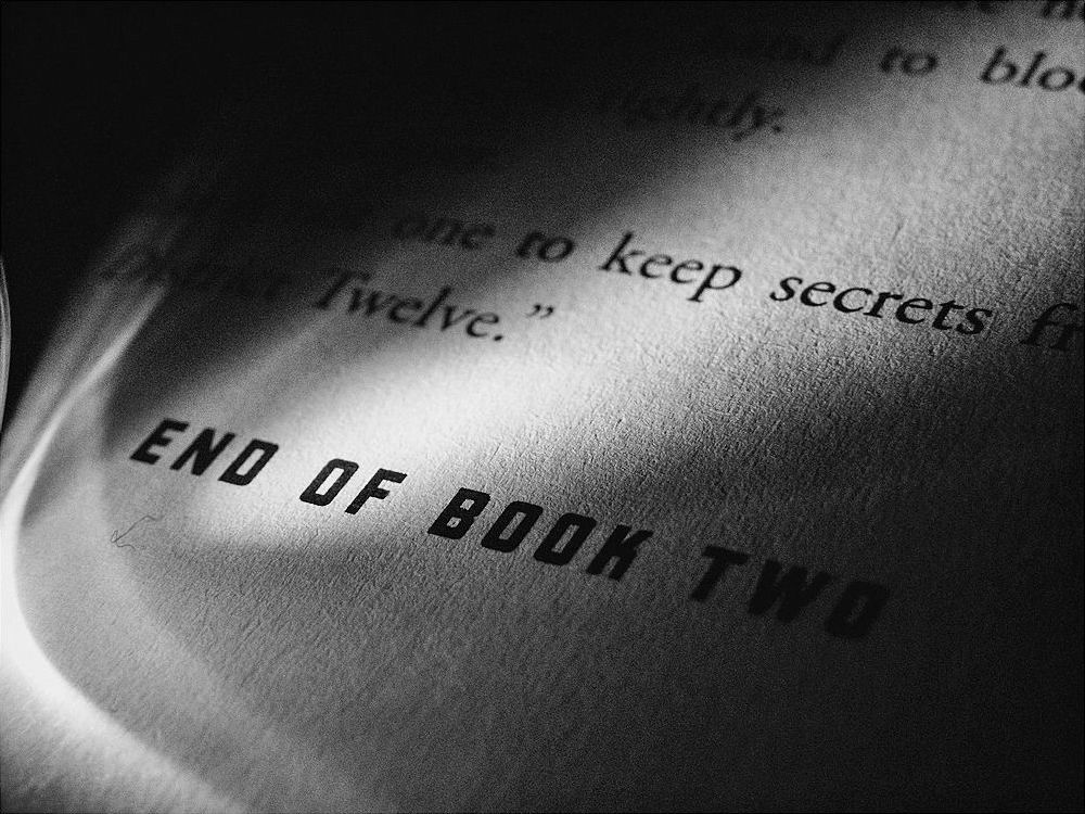
Chank’s font Liquorstore in use in the Hunger Games series.
As Chank’s skills have grown, he said his fonts have become more “boring.” “It’s very frustrating to take the character out of my fonts,” he said. “The weird little mistakes I had early on made them more interesting.”
His given name, Charles Richard Anderson, was chosen with the help of his five older siblings, between the ages of 6 and 14 at the time. The reasoning was that “he could do a lot of stuff with [the names] if he wanted to be more creative with it,” said Laurie Bukalo, his older sister by 11 years who knows him as Charlie.
Despite all the possible variations of “Charles” and “Richard,” he scrapped them both for the nickname Chanky. When he got older, it became Chank because it sounded “more professional.” “Diesel” was a later invention when he decided that “Chank” was too short to sign his art with.
As design evolved for the screen and fonts became simpler and less distinctive, demand for Chank’s fonts fell. “There’s not a lot of work, but I get it somehow,” he said. “Some people still want to pay for some personality and some flavor.”
Chank Co, once a multi-person business with a board of directors, is now just him. He still has the “board of directors” though, which includes a few of his college friends. He goes to them for accounting and legal advice. “They all know things that I don’t so much,” he said.
He didn’t always worry about that sort of thing. Around the turn of the century, chank.com’s footer bore the warning, “Steal my shit and I’ll decorn your cob.” One of his earliest fonts included the license of “Copyright Schmopyright,” remembers Ruthann Godollei, one of his professors at Macalester. (Chank spent five years at Macalester but never graduated.)
He’s also watched the thriving design community he knew in the 1990s start to fade. “I can’t connect with [them] like I used to,” said Chank. “I don’t know if it’s me or if it’s them.”

He sometimes wishes that he had someone else to “bounce ideas off of,” but jokes that it might be difficult to find someone. “I don’t know if people have the stomach to handle a lot of me,” he said.
Maybe that was true 20 years ago when he designed zines, sold grunge fonts on floppy disks, and slept in a basement. Now, he works with corporate clients such as Target and Major League Baseball. “I’m always frustrated because I can’t be that true punk character that I am inside,” he said of his more recent work. “It’s bad for marketing purposes.”
However, he’s still found ways to stay on the cutting edge; he’s been making forays into “web3” and other technologies currently in vogue. “There’s got to be something new other than just serif and sans serif,” he said.
Recently, he worked for a virtual reality game studio, used artificial intelligence to create fonts, and experimented with three-dimensional fonts for whatever form “the metaverse” takes.
In his early years online, Chank sold fonts from his own website. Visitors would browse his catalog, carrying their virtual shopping bucket. “Everybody else had a shopping cart,” Chank said. “I wanted to do something different.”
The decision to do something different came naturally to him. “[I thought] it would be funny if people had a bucket, you could drop your fonts in, I love the [mental image] that it creates.” Now, Chank mostly sells his fonts through marketplaces with shopping carts like MyFonts and Fonts.com.
In 2014, Chank published The Travelling Font Salesman, a book featuring his best work. “I always liked traveling salesmen,” he said of its title. “They’re always making new friends. They’re clean and they smell good.”
He particularly connects with the inventor of the Brillo pad, whose name has been lost to time. “[He] was a traveling salesman selling cast iron skillets,” he said. “His fortune was just kind of a side hustle.”

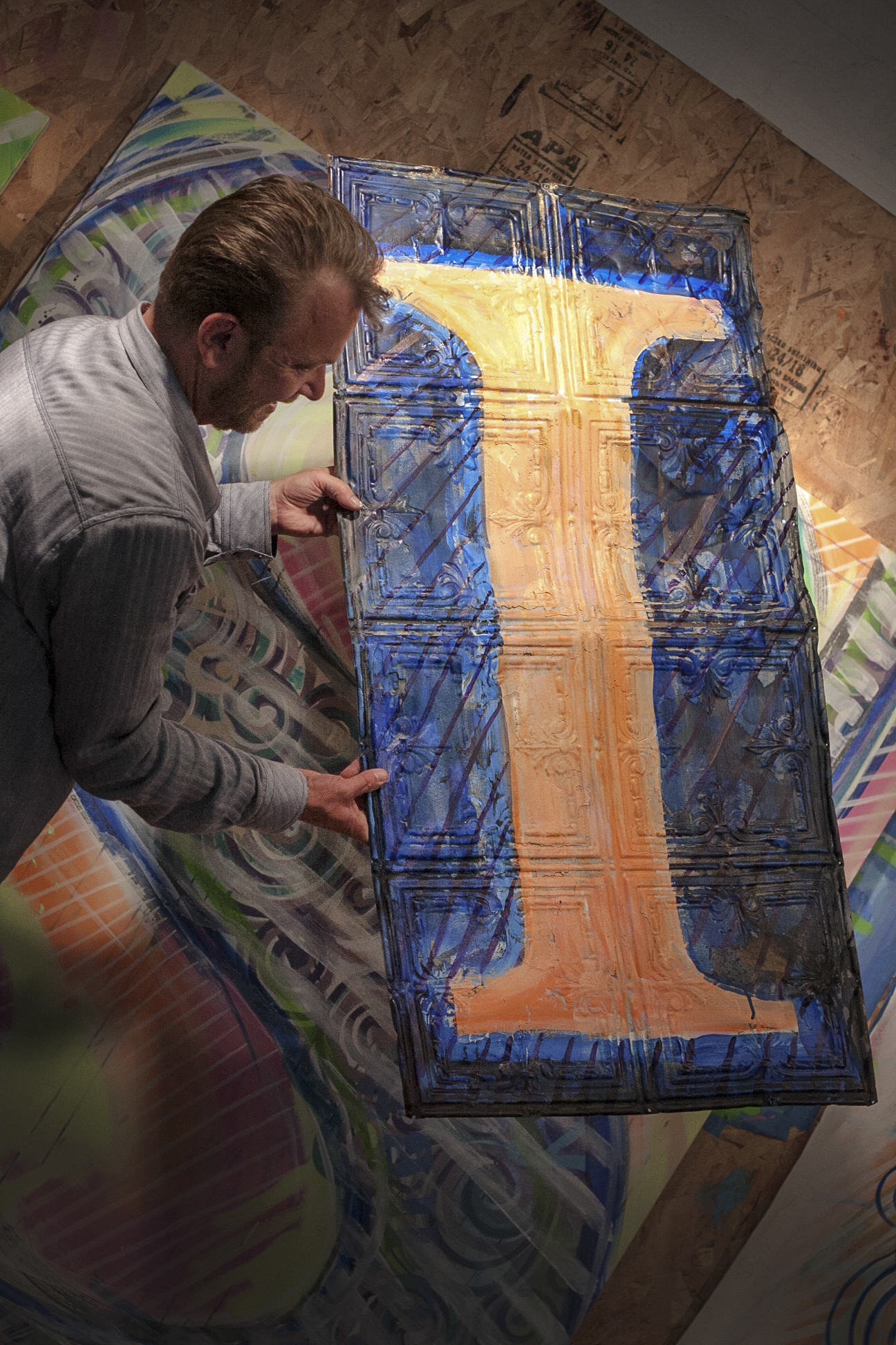
Chank working on a mural for Creative Lighting, a business in Saint Paul.
Living up to the name, Chank performed a traveling font show in 1999. “Most people haven’t met a font designer,” he said. “So wherever I went people had lots of fun questions.” The tour came at a time of financial hardship for Chank. “I had to hustle and so I just wanted to go to as many cities as I could,” he said. “It was fun, but I was happy when it was over.”
In his book, he recounts when, in sixth grade, he was held after school to improve his handwriting (he is a leftie). “[I went] from a kid with ugly handwriting to a world-renowned handwriting expert,” he writes.
Ironically, he used to design handwriting instruction booklets, with arrows showing young students how to form the letters. “[That work] is so boring and safe,” he said. “They don’t want to change from the way it’s been taught for the last hundred years.”
Similarly, Chank used to think his masterpiece would be an elegant book font with serifs and dozens of weights, something he would give his name to—“Anderson Garamond” could typeset the Bible. Today, he’s not so inclined. He’d rather “bring a soulful, human element to fonts.”
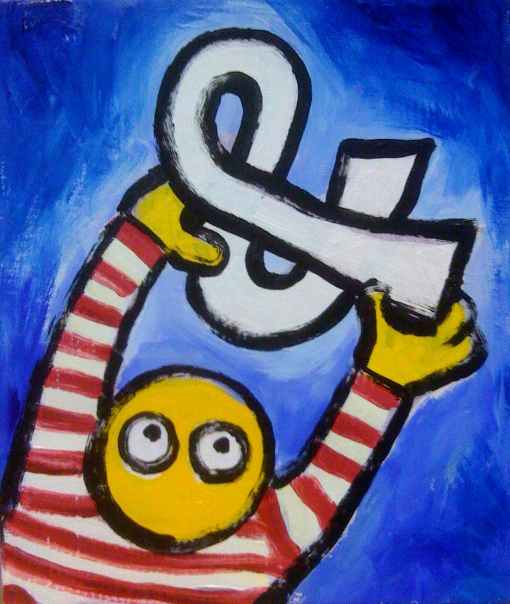
“Alphabetician” was a title he coined to describe his all-encompassing obsession with letters. In addition to designing fonts, he paints letters as art. A recurring character in his work is a simple face, usually only two eyes inside a circle.
“People think it’s a happy face just because it’s yellow, but it’s not,” he said. “He’s freaked out because there’s so much to see and do in the world.”

#16,040, Ampersand Boy

#15,517, Ding of the Hill
Curiosities of Macalester
An occasional email with new stories and discoveries