The Forgotten Art of Macalester’s Course Catalogs
by Jerome Paulos • April 7, 2023
Before the internet, prospective students would browse lists of colleges maintained by their high schools, pick their favorites, and send away for informational materials.
As such, printed course catalogs were a prominent face of Macalester from the 1800s until they were discontinued in 2009. In addition to courses, they were channels for marketing like that now found at macalester.edu.
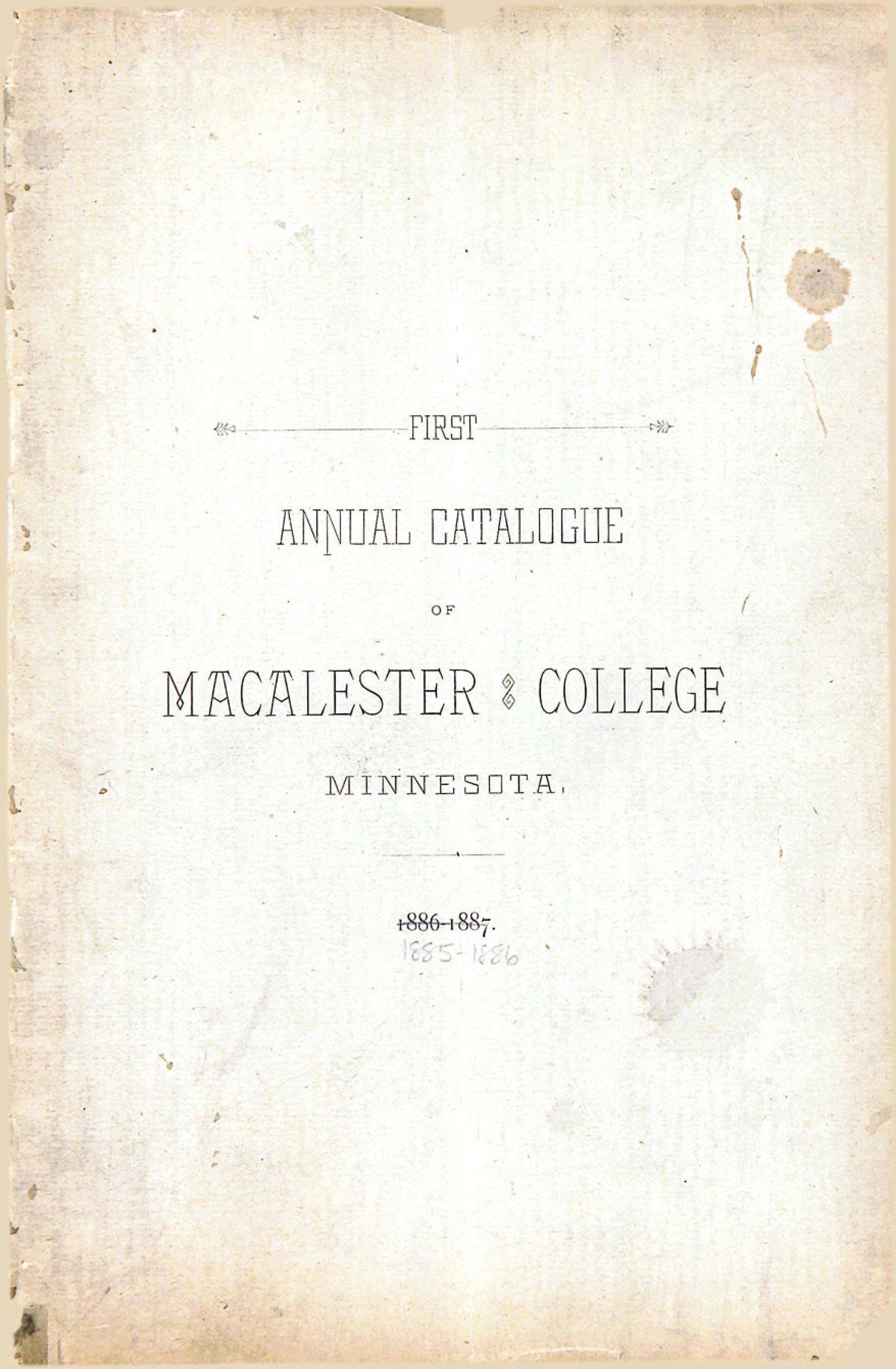
‘First Annual Catalogue of Macalester College, Minnesota’
Macalester’s first course catalog, published almost 140 years ago, features a letter from founder Edward Duffield Neill written when he was first pitching the college in the 1850s.
“The picturesqueness of the scenery will make it a classic spot for students,” he wrote. “There must be a College in this portion of the Mississippi Valley.”
The catalog continues, bragging about Macalester’s location “about five miles from the business centers of the Twin Cities.” In contrast to the 40-minute, two-transfer journey to downtown Minneapolis today, “[Macalester] is, by the [street]cars, a ten minutes ride to either,” the catalog notes.
Then, a line of marketing still used by the College: “All of the advantages of the cities are had, without any of the disadvantages.” The disadvantages being, in the late 19th-century, “saloons or other temptations to immoral habits.”
“Presidents of eastern colleges familiar with the location,” the catalog finishes, “pronounce it the best they have any knowledge of in this country.”
The enviable public transit aside, Macalester’s course catalogs have also been a source of enviable graphic design.
From the browning pages of catalogs from the early 1900s, often bearing an engraving of Old Main, to the modernist blue and white lines of the postwar catalogs, catalogs reflected the artistic movements of the time.
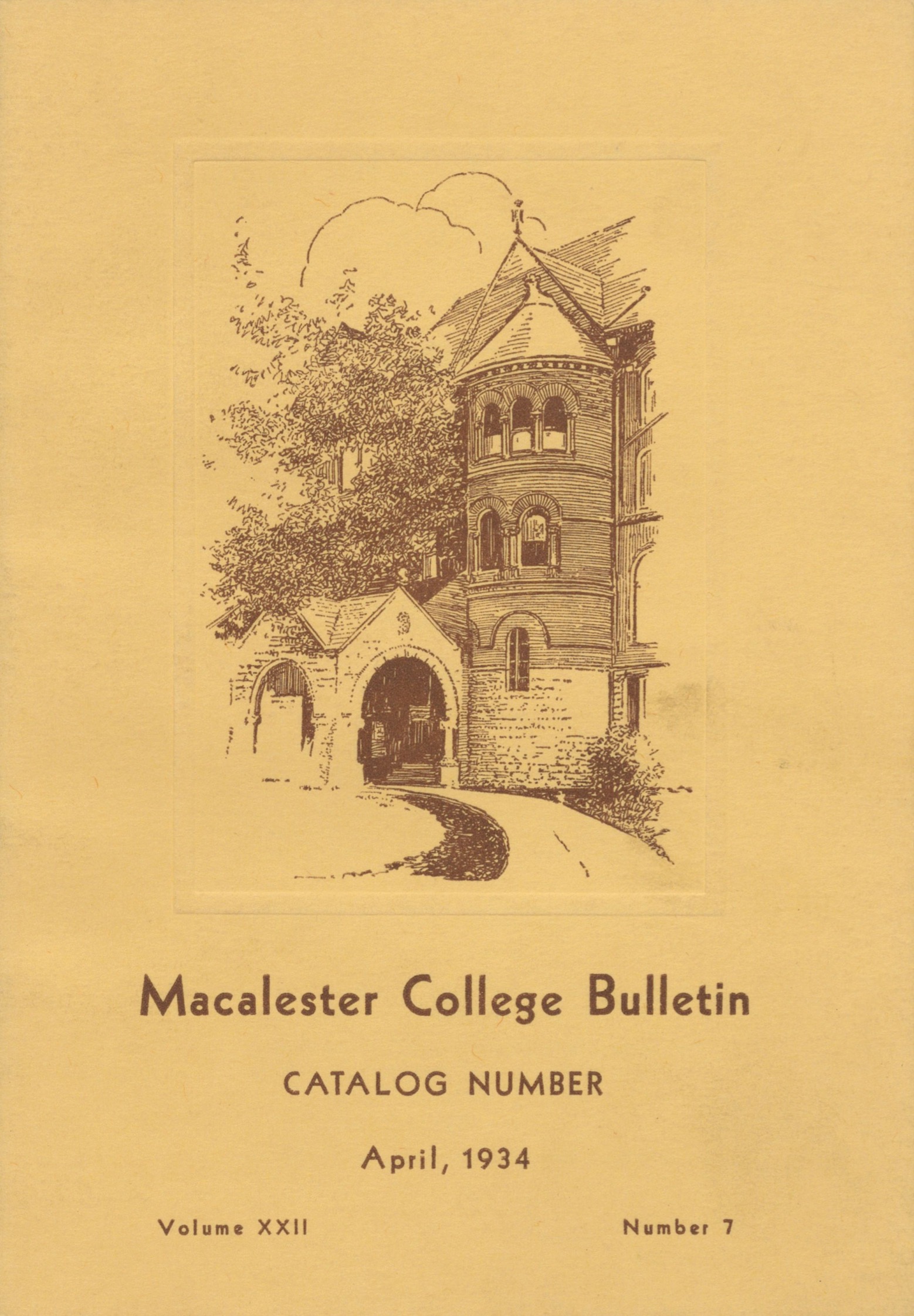
1934
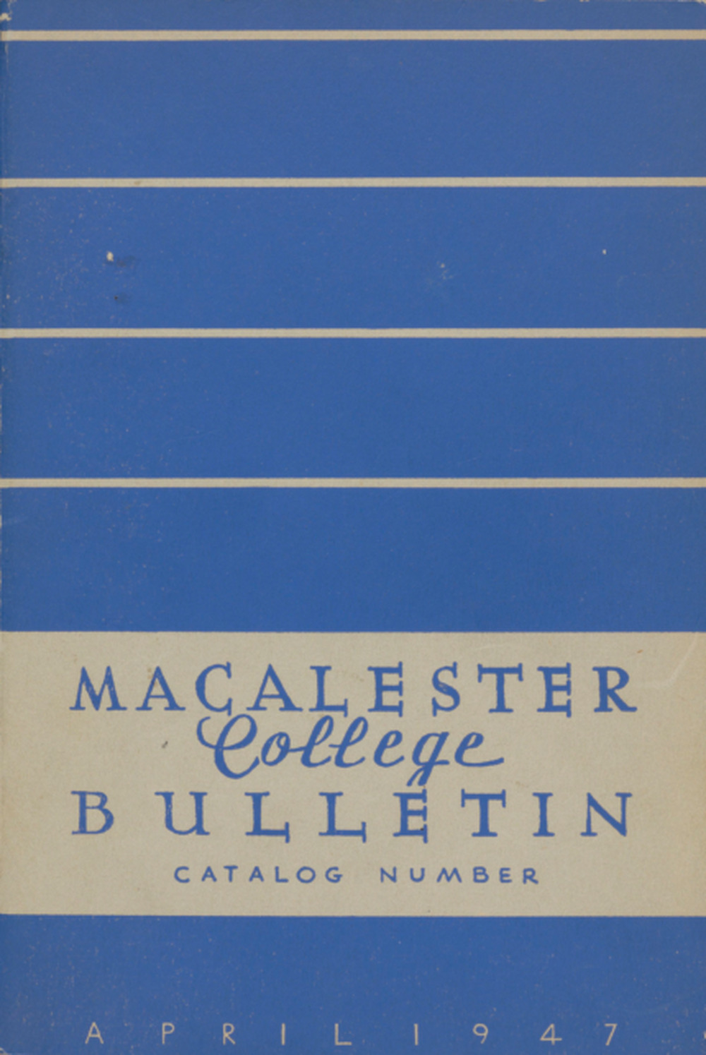
1947
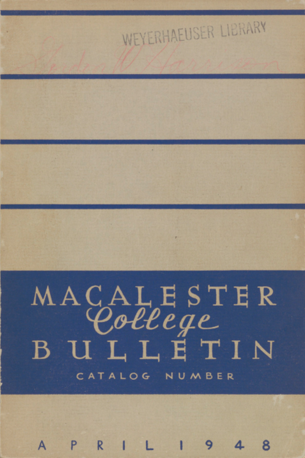
1948
Catalog designs in the early ’60s introduced the great-grandfather of the current Macalester shield. That red tartan-clad sheild can still be found in corners of campus, such as on Macalester Stadium, which was built in 1964.
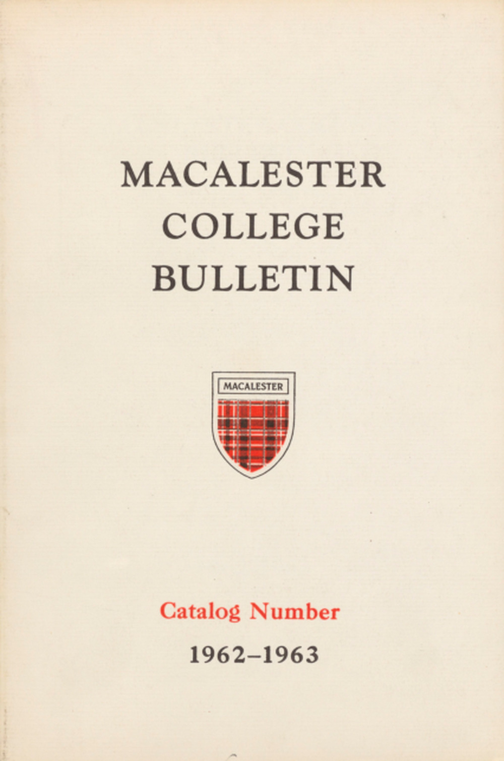
1962
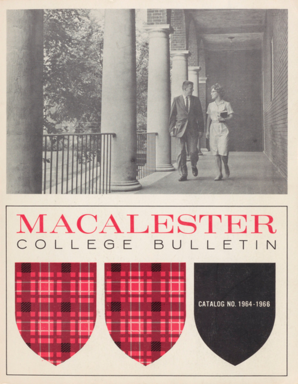
1964
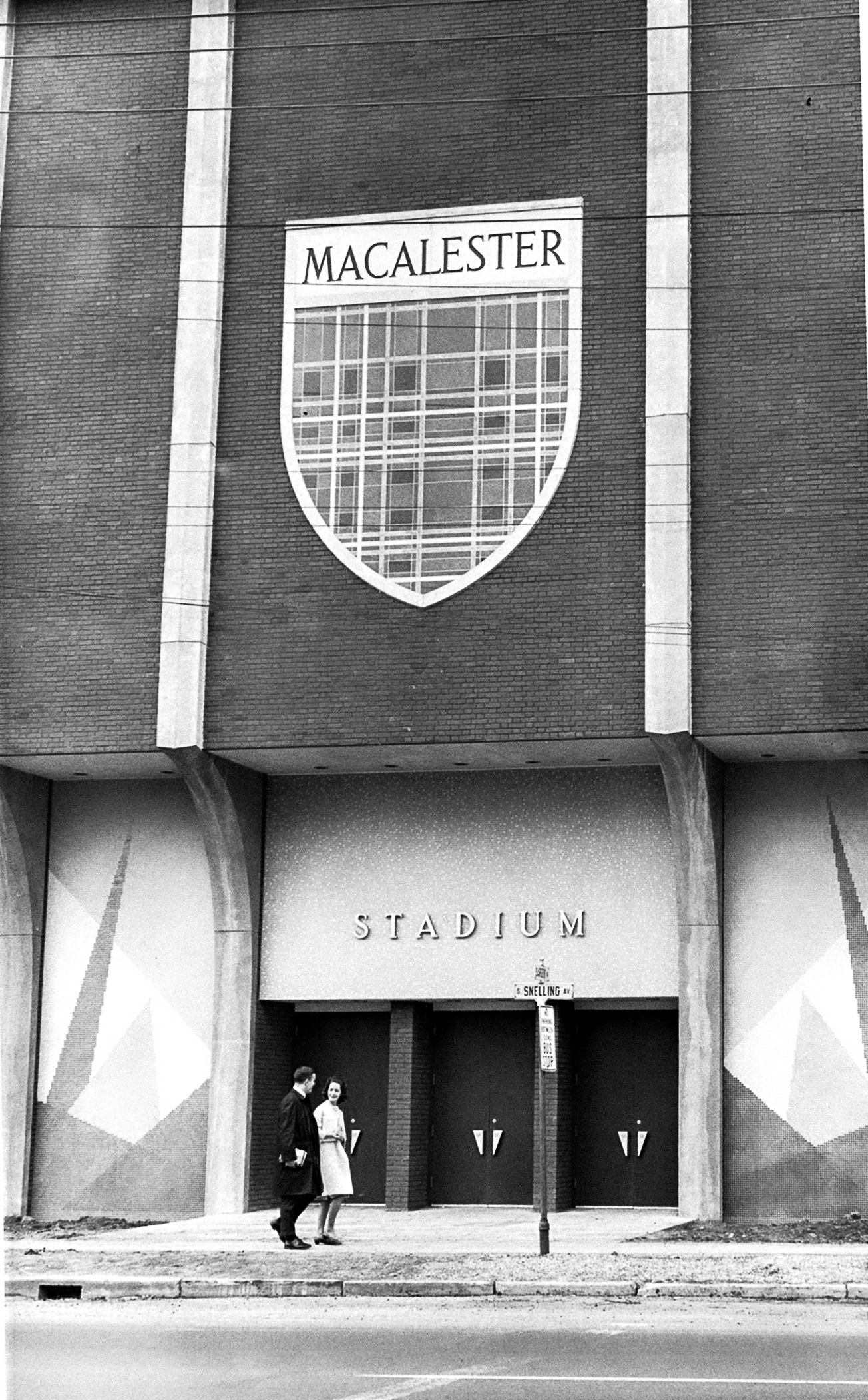
Later in the decade, designers played with intersecting shapes and light mixing, and dabbled in pop art; 1966’s catalog is reminiscent of the classic ‘Thank You’ plastic bags, but likely predated them.
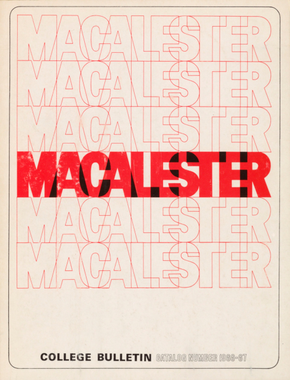
1966
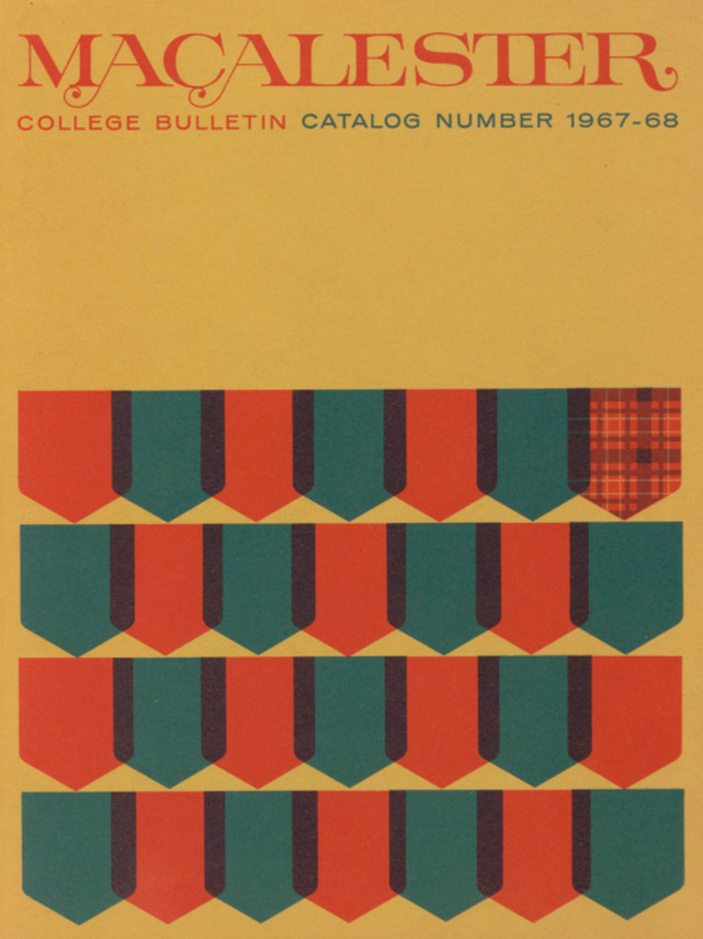
1967
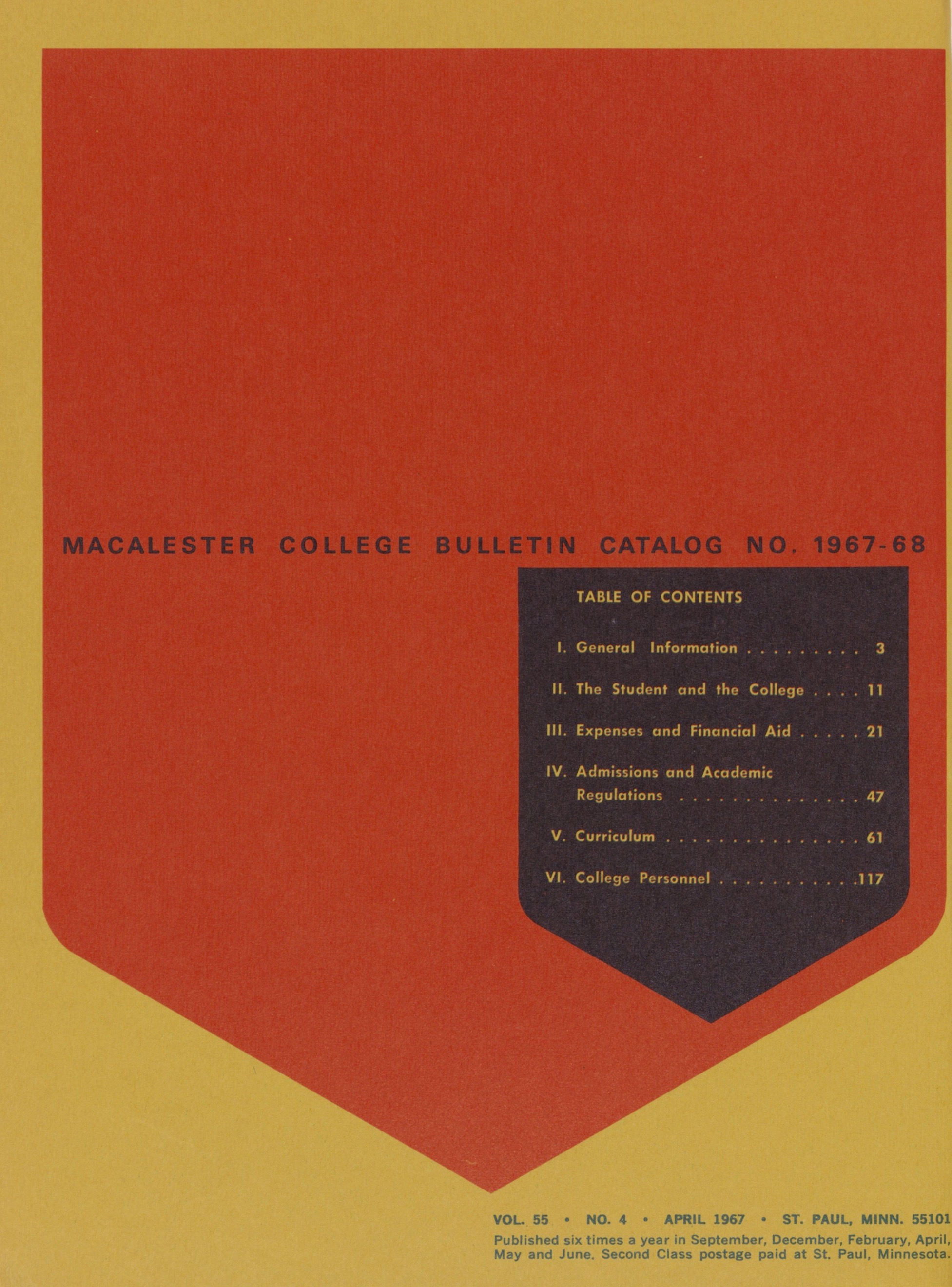
The decade closed out with the debut of Helvetica and the influence of Swiss design. The classic font would grace the pages of the catalog until the mid ’70s.
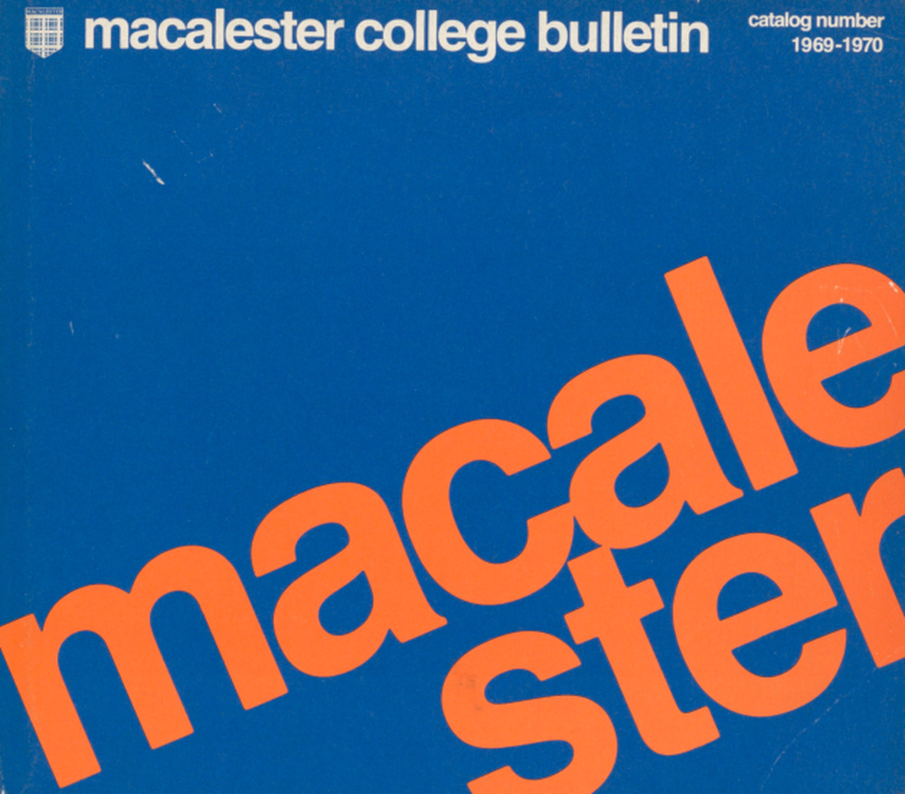
1969
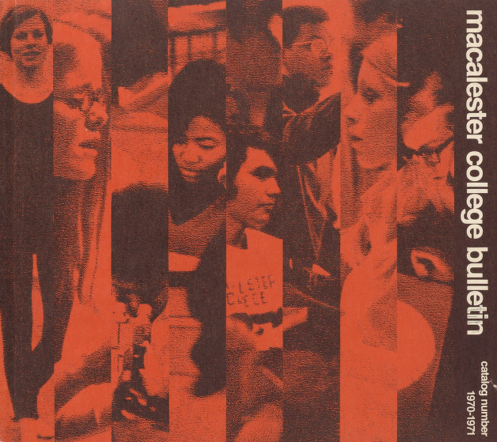
1970
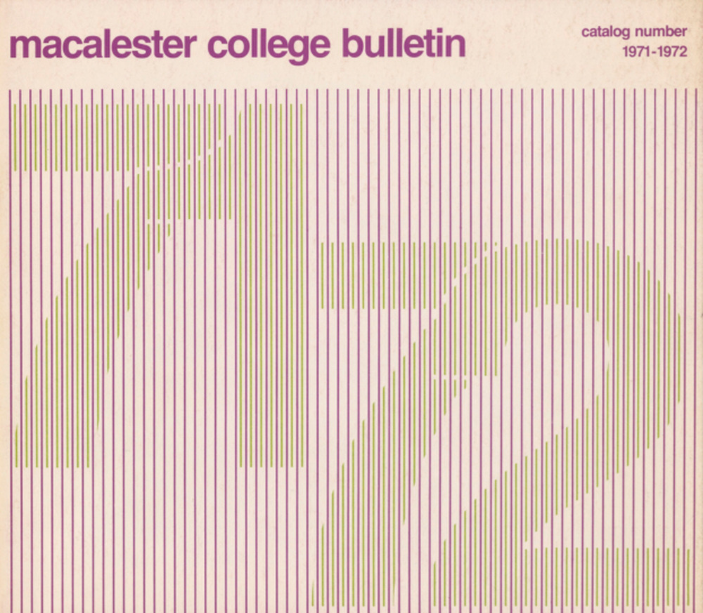
1971
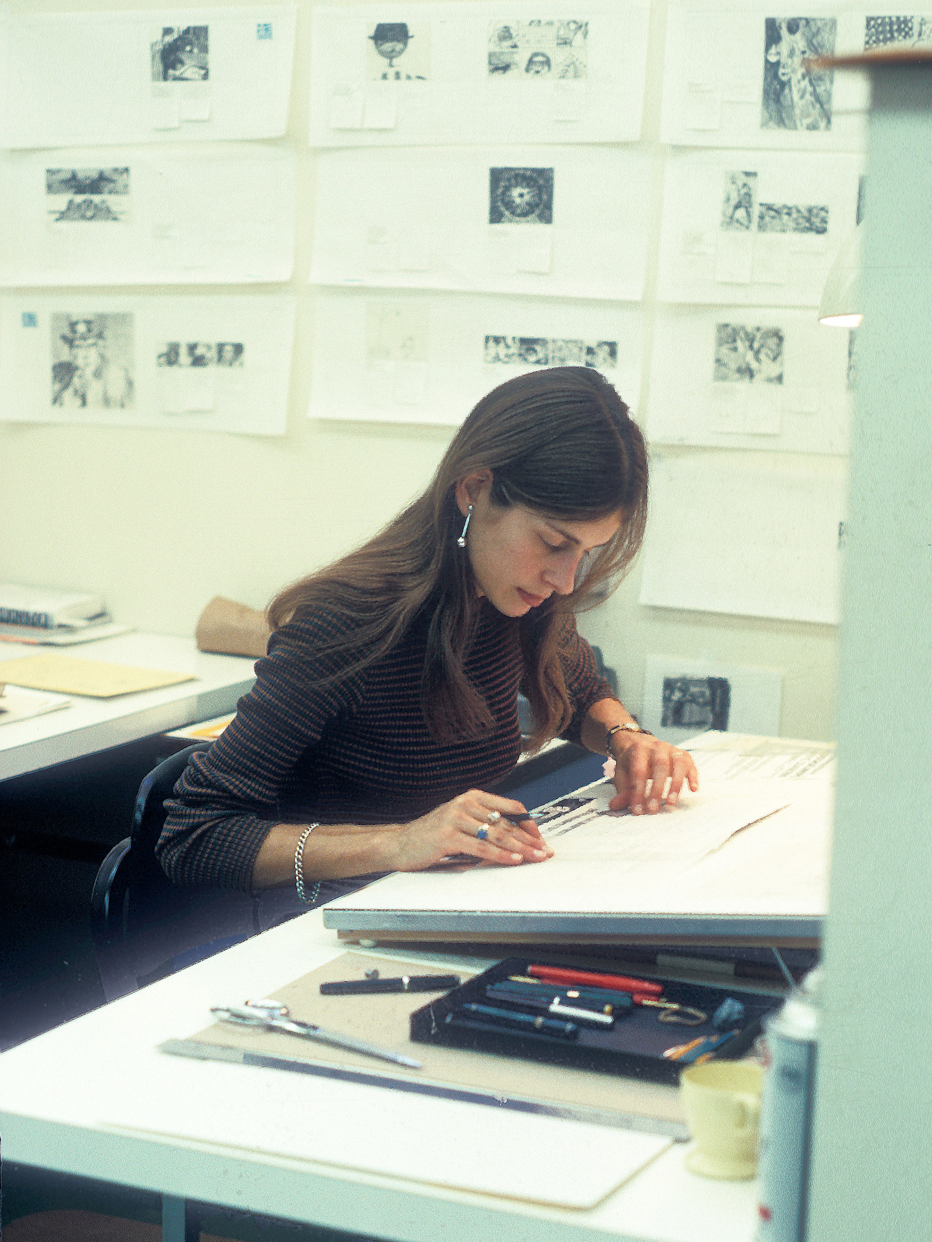
Reineck at Saul Bass & Associates in 1971.
Gay Reineck, who briefly taught at Macalester, created advertising graphics for summer classes in 1970. She made them when she worked at InterDesign, a Minneapolis-based design firm co-founded by the architect that designed Weyerhaeuser Chapel.
“I have a deep interest in typography and repetition,” she said, reflecting on her designs. “I just think things should be simple and strong.”
These graphics were produced 17 years before the release of Adobe Illustrator, using a very manual process that involved cutting, pasting, tracing, and drawing fonts and patterns.
She transitioned to computer design software as it became more widely available in the mid 1980s.
“[Design software is] marvelous, it’s given freedom to anybody to be a designer,” she said. “But you still have the same requirements to be good…you have to have some visual sense. So you still need to train, understand typography, spaces. The same rules apply, it’s just a different [medium].”
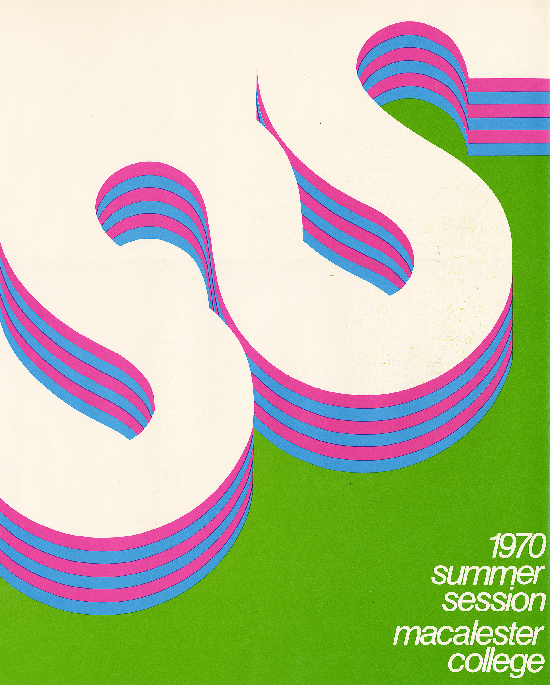

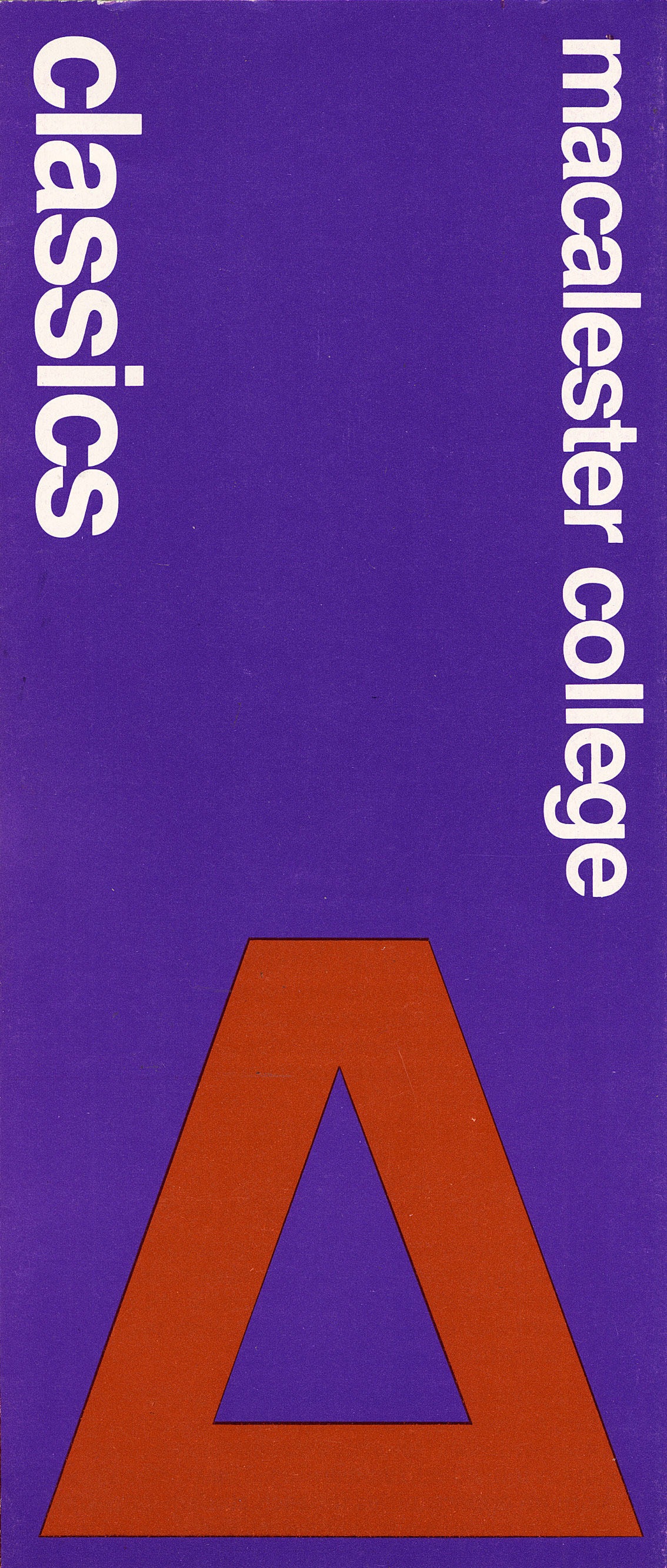
A catalog cover and two brochures Reineck designed in 1970
Gay Reineck
Catalogs throughout the ’70s feature an array of ominous bagpipers, arranged in an echelon formation in a field or navigating a snowy path.
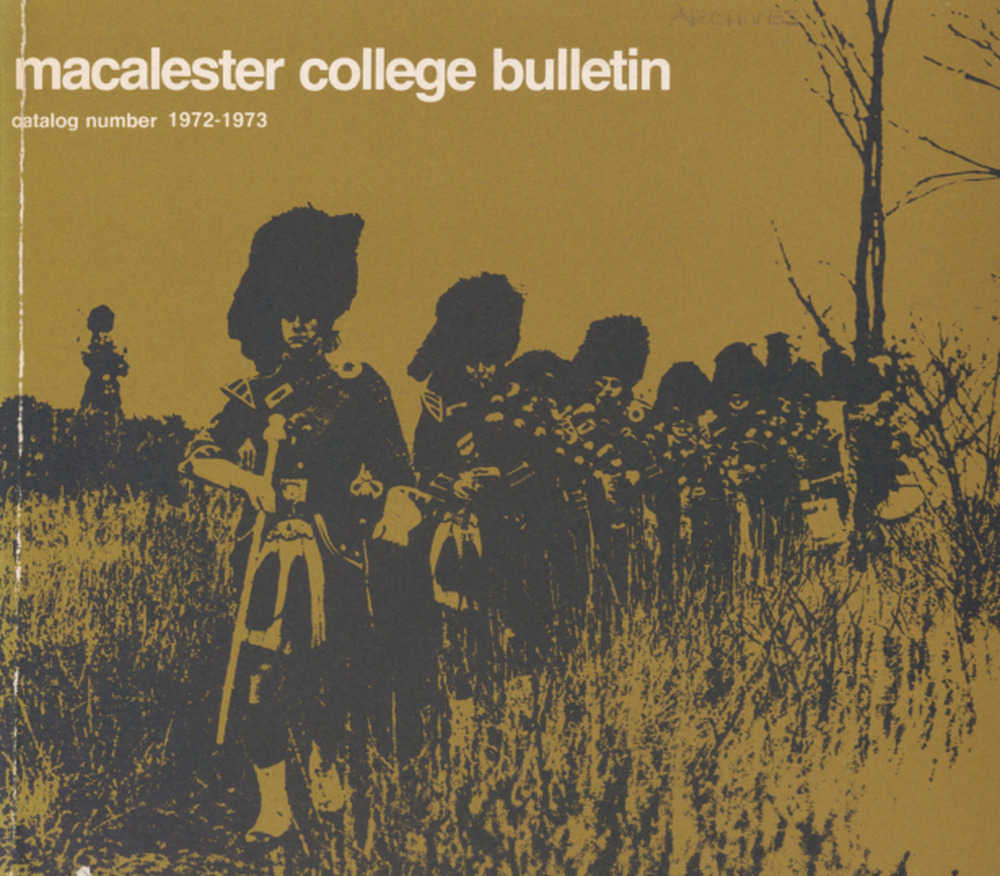
1972
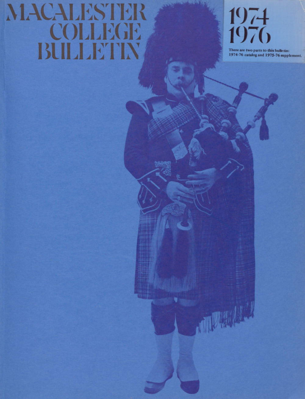
1974
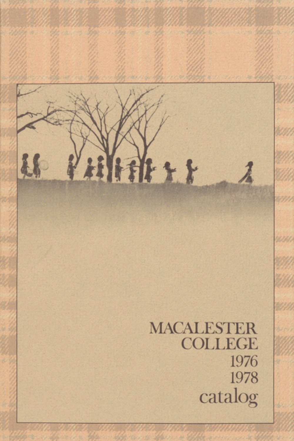
1976
Catalogs in the ’80s took an entirely new direction, experimenting with still-life photographs of the MacAlister clan tartan draped over books and a brooch.
In a whiplash-inducing change of design, the ’80s ended with a bang of off-neon colors, colors that wouldn’t be out of place on a Chuck E. Cheese carpet or disposable paper cup.
Unfortunately, returning to the generic, the final decade of catalogs featured an unrelenting stream of photos of the Macalester campus, aflame with fall colors.
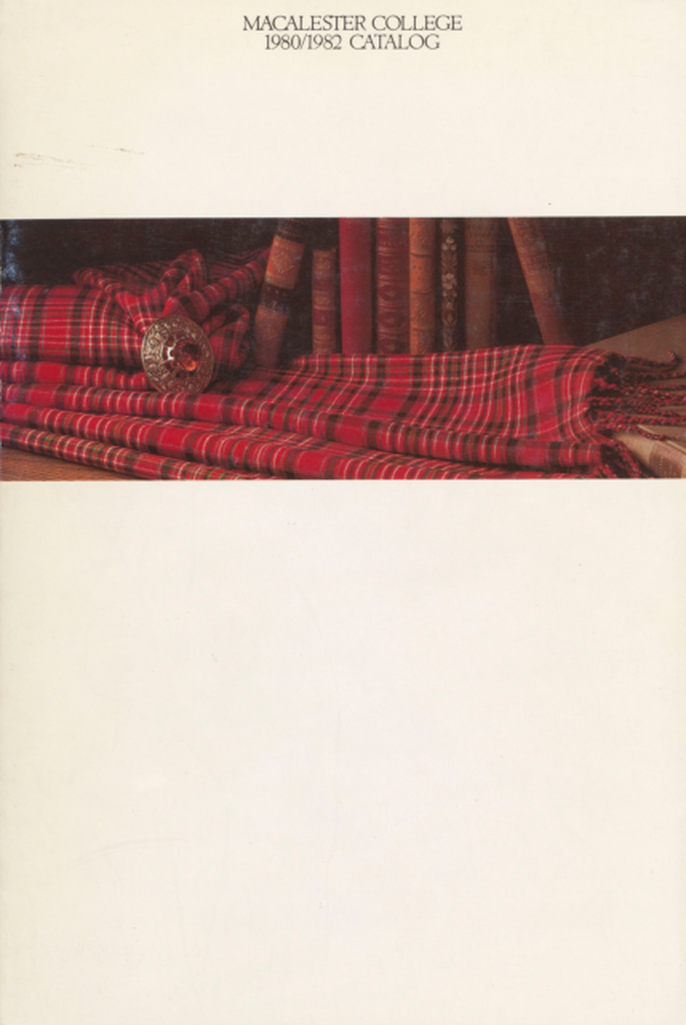
1980
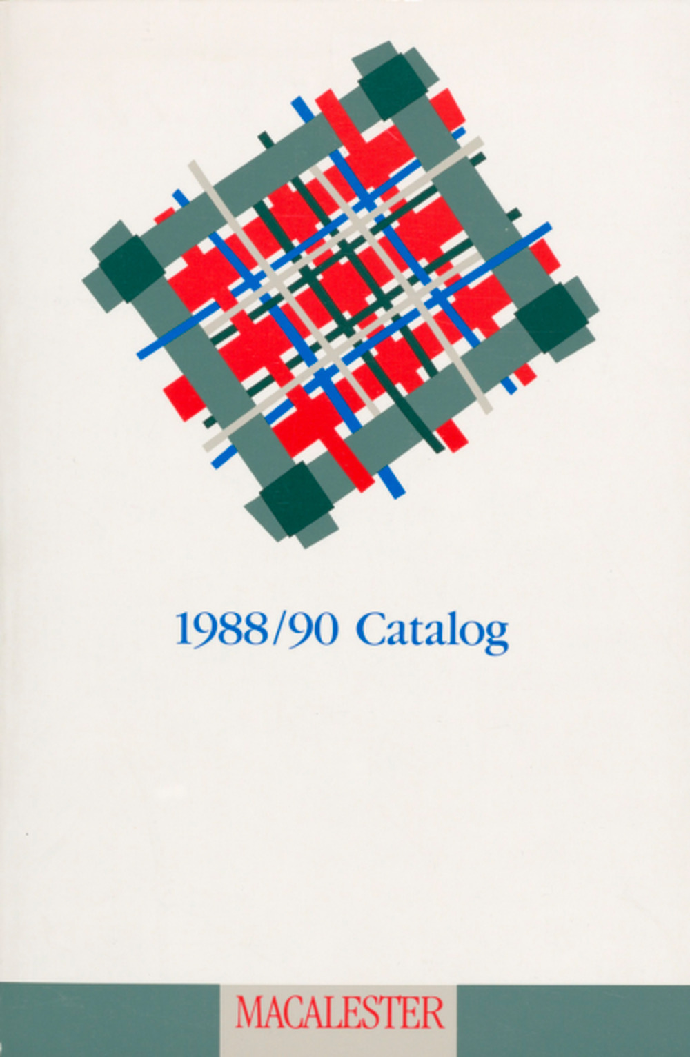
1989
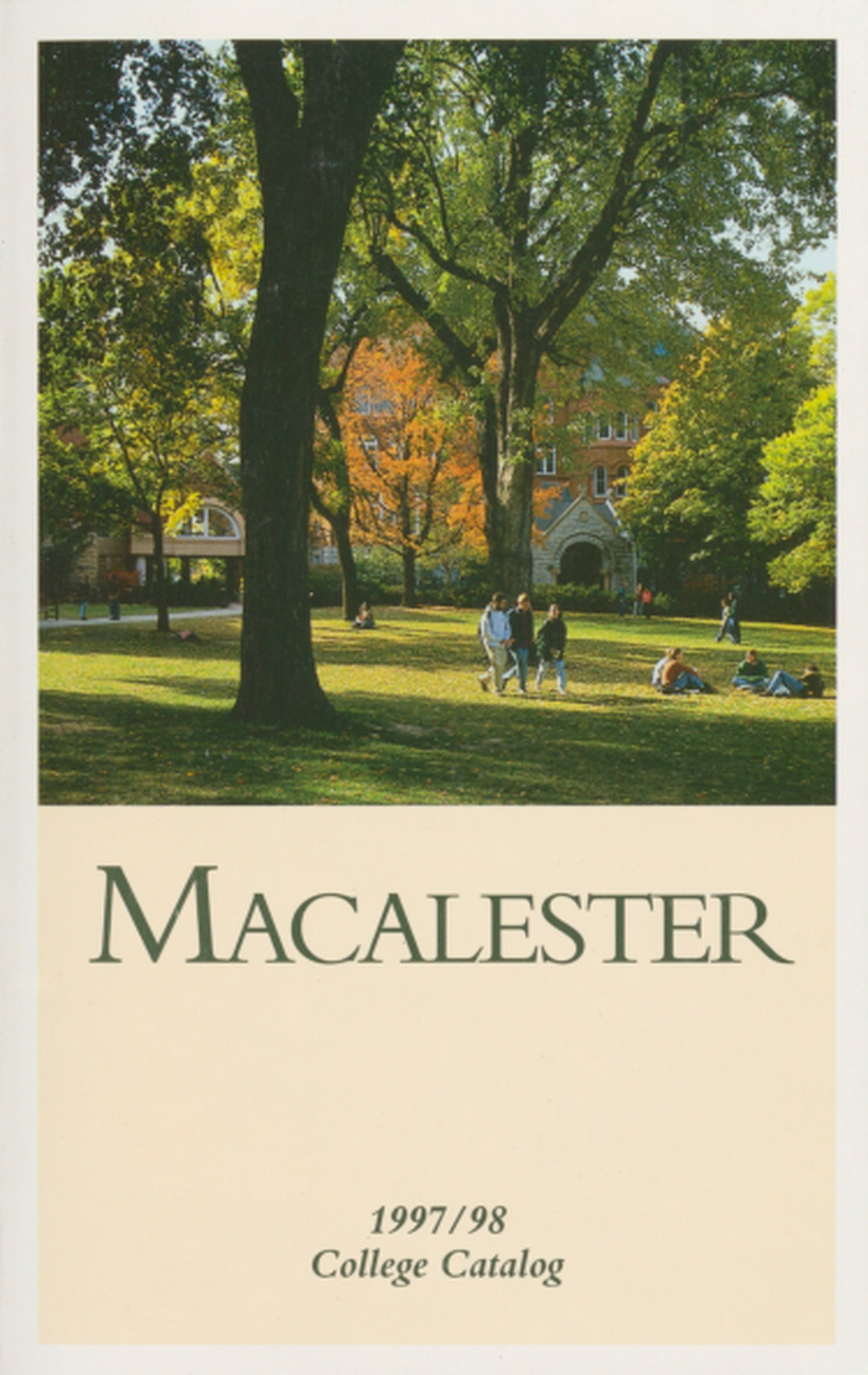
1997
Curiosities of Macalester
An occasional email with new stories and discoveries